Education
Here you will find all the knowledge and tools for confident trading in the
Moonbot terminal:
from understanding terms and strategies — to trade analysis and risk control.
What is Technical Analysis and the Main Types of Charts
is a method of forecasting future price movements based on historical price and volume data. While fundamental analysis attempts to determine what an asset should be worth, technical analysis focuses on how it is currently being traded, assuming that the market already “knows” everything necessary.
Core principles of technical analysis:
-
Price reflects everything — all factors affecting the asset are already priced in
-
Prices move in trends that can be identified and used
-
History repeats itself — market patterns tend to recur
Main types of charts
The most common and useful types of charts for analysis are: line chart, bar chart (OHLC), and candlestick chart. Each provides a unique way to visualize market data.
1. Line Chart
The simplest chart type that connects closing prices with a line. It shows the overall price trend without details of intraday fluctuations.
Advantages: easy to grasp overall trend, removes “noise” from short-term movements, ideal for long-term analysis.
Disadvantages: does not show opening price, high or low of the period; limited usefulness for short-term trading or analyzing volatility.
2. Bar Chart (OHLC)
Each bar displays four key prices for the period: Open, High, Low, and Close. A vertical line shows the range between high and low; the left tick marks the opening price, and the right tick marks the closing price.
Advantages: provides complete information on price activity and volatility for the period; allows analysis of the relationship between open and close prices.
Disadvantages: less visually intuitive compared to candlesticks; harder to identify patterns and requires more time to analyze.
3. Japanese Candlesticks (Candlestick Chart)
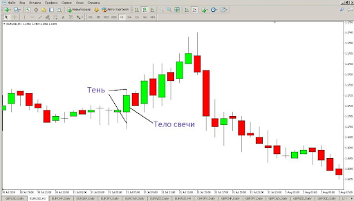
-1767975464.png)
Candle colors:
-
Green (or white) candle — closing price is higher than the opening price (bullish)
-
Red (or black) candle — closing price is lower than the opening price (bearish).
Advantages: highly visual representation of price data, easy identification of patterns and market sentiment, quick visual assessment of buyer and seller strength.
Disadvantages: may generate false signals on short timeframes, requires studying numerous candlestick patterns, sometimes overly detailed for long-term analysis.
4. Tick Chart
A tick chart is the most detailed representation of market data, where each individual trade (tick) is displayed as a dot or line on the chart. Unlike candlestick charts, which group many trades into fixed time intervals, a tick chart shows every transaction the moment it occurs.
Advantages: maximum granularity of market information, all trades are visible without averaging, enables tracking of large players’ activity in real time, ideal for high-frequency scalping, provides insight into market microstructure.
Disadvantages: enormous data flow requires professional equipment and specialized analytical skills, high demands on data processing speed, unsuitable for analyzing long-term trends, not available on all trading platforms, excessive detail creates noise for non-professionals.
Important: most exchanges provide chart data in candlestick format with a minimum interval (usually 1 minute). Tick data is available through specialized terminals and APIs and requires more complex technical infrastructure. For beginner traders, tick charts are excessive — it’s better to start with candlestick charts on timeframes of 15 minutes and higher.
Data granularity ladder: from tick chart (each trade) → 1-minute candles → 5-minute → 15-minute → hourly → 4-hour → daily → weekly → monthly. The smaller the granularity, the more precise the market insight — but also the higher the demands on equipment, reaction speed, and trading expertise.
Timeframes and How to Choose Them
A timeframe determines the period of time each candlestick or bar on the chart represents. Choosing the correct timeframe is critically important, as it directly impacts the quality of trading decisions. A timeframe that is too short can produce excessive market “noise” and false signals, while one that is too long may conceal short-term entry opportunities and hinder precise timing.
Your timeframe should match your trading strategy, personal temperament, and the amount of time you are willing to spend on analysis. Use the following core principles as a guide:
-
Choose a timeframe that fits your trading strategy
-
Use higher timeframes to understand the overall trend
-
Use lower timeframes for entry and exit points
-
Beginners are recommended to use timeframes of 1 hour and higher.
How to Choose the Right Chart Type
For beginners, Japanese candlesticks on 1h–4h timeframes are recommended as they offer an optimal combination of clarity and informativeness. As you gain more experience, you can experiment with other chart types and timeframes.
Checklist for Working with Charts
1. Choose a reliable trading platform with high-quality charts
2. Start with Japanese candlesticks on a 4-hour timeframe
3. Learn the basic elements of a candlestick (body, wicks, colors)
4. Practice switching between timeframes
5. Compare the same price movement across different chart types
6. Identify the chart display that is most comfortable for you.
Common Mistakes When Working with Charts
-
Using very short timeframes without enough experience
-
Ignoring higher timeframes in analysis
-
Constantly switching between chart types without building skill
-
Trying to analyze all available timeframes simultaneously
-
Choosing an unsuitable chart type for the specific trading strategy.
Understanding the basics of chart analysis is the foundation for learning all other technical analysis tools. Start by observing how price moves on a chart, then gradually progress to more advanced concepts and tools.