Main Terminal Window with Advanced Settings
Buttons at the left side of the main toolbar window of the terminal
Scale Buttons
In the top-left corner of the chart are the scale buttons, used to set the chart's zoom level.
For spot terminals, the first scale set has fixed values: 100%, 50%, 20%, 10%, 5%and Auto. Clicking the x9 button switches to an extended scale set: 1000%, 500%, 200%, 100%, 50% and Auto.
For futures terminals, the default values are: 50%, 20%, 10%, 5%, 2% and Auto. Clicking x9 switches to: 500%, 200%, 100%, 50%, 20% and Auto.
These percentage values are fixed and cannot be customized by the user.
The algorithm behind the Auto scale button in the main Moonbot window calculates scale based on the 3-hour price delta and is recalculated when centering the chart. Chart centering can be done using the hotkey CTRL + Right Arrow, which can be configured under Settings → Hotkeys in the Center Chart field.
Some users prefer to start with a smaller scale, such as 5–10%,to scalp short-term moves, and later switch to a larger scale to hold trades longer and avoid reacting to minor price fluctuations.
The coin chart is always divided into 10 vertical blocks. For example, with a 10% scale, each block represents 1% of price movement, and the entire 10-block area corresponds to a 10% total change, according to the selected scale.
Additionally, each fixed scale button allows manual adjustment within double the range — up or down. For example, with a selected scale of 10%, the chart can be stretched up to 20%or compressed to 5%.
To adjust the scale manually:
-
Hover your mouse over any part of the chart
-
Hold the right mouse button
-
Move the cursor upward to increase the scale up to 20% (the chart will appear smaller) or downward to decrease the scale to 5% (the chart will appear larger).
This method allows you to quickly fine-tune the scale without switching fixed scale buttons.
Stretched scale applies only to the current coin. When switching to a new coin with the 10% button active, the chart will load with the default 10% scale, ignoring any previous manual changes.
To return the chart to the default 10% scale, simply click the 10% button again.
You can also change the scale using hotkeys, which are configurable in Settings → Hotkeys in the Scale + (increase scale) and Scale - (decrease scale) fields.
“:” Button
The “:” button allows you to hide or display part of the interface elements located to its right up to the coin search field, when the terminal window is compressed.
If the terminal window is compressed and the “:” button is not pressed, the buttons to the right of it will automatically be hidden as the window size decreases
If the terminal window is compressed and the “:” button is pressed, the buttons to the right of it remain visible regardless of the window size.
Show BID/ASK Lines Button
The Show BID/ASK lines button enables or disables the display of current buyer and seller price lines, which are formed by limit orders in the order book.
The green line shows the level of buyer limit orders (BID), and the red line shows the level of seller limit orders (ASK). The distance between these lines is called the price spread.
These lines can be used to assess the gap between supply and demand. However, they may visually overload the chart, so in everyday trading, they are usually turned off to better see the trade markers (crosses) and the average price line.
“Show market history” Button
The Show market history button shows or hides trade crosses. All green and red crosses on the chart represent trades — that is, executed market buy or sell transactions at a certain price.
If you hide the trade crosses, only the average price line (the midpoint of the spread) will remain visible on the chart, but without the crosses, you won’t see sharp spikes upward or breakdowns downward — both of which are important for proper strategy tuning.
These spikes help determine the best distance to place Buy and Sell orders for a given coin. The density of the crosses reflects activity: the more crosses and the closer they are to each other, the more densely packed the limit orders are in the order book.
If an almost vertical series of crosses appears on the chart, it means someone sold a large lot, and the trades executed sequentially — first at one price, then at the next, consuming all limit orders in the order book until the entire lot was sold.
Such spikes often hit a large limit order(“‘wall’) in the order book. To sell your position faster during an upward spike, it’s better to place your Sell order just below the large limit order in the red order book. That way, your order will be filled faster than the larger one positioned higher.
Stop-losses are best placed below a large limit order in the green order book, so that this order can absorb a downward spike and help protect your stop and slow further price decline.
"Draw only last completed buy order" Button
The Draw only last completed buy order button allows you to control the display of buy order lines on the chart. When this button is enabled, you can choose to display all buy lines of closed trades, or only the most recent one, as well as whether to display buy lines of active trades. If you press the button to display all buy lines, you’ll be able to see exactly where purchases were made for that coin. However, to avoid cluttering the chart, the mode of showing only the last buy line is usually preferred.
Vol Button
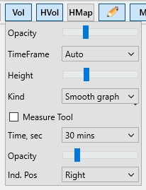
The Vol button (Vertical Volumes) enables graphical display of trade volumes as a histogram at the bottom of the chart window.
This feature is available only to PRO version users with the MoonScalper module activated. Clicking the button enables volume display; disabling it hides the volume histogram.
The histogram helps visualize where certain volumes occurred on the chart. A predominance of green bars indicates buying pressure, while red bars indicate selling pressure. Analyzing volume changes can help you anticipate price movements and identify accumulation zones or seller unloading zones, which may lead to future price increases or declines.
Right-clicking the Vol button opens additional vertical volume settings:
-
Opacity – sets the transparency of the volume histogram
-
TimeFrame – sets the measurement interval. Volume at any moment is calculated as the sum of trades within the selected interval. Buy and sell volumes are displayed separately
-
Height – sets the height of the volume display area as a percentage of the chart’s total height
-
Kind → Smooth Graph – sell volume (red) is overlaid on top of buy volume (green); the total bar height equals the larger of the two
-
Kind → Stacked Graph – sell volume (red) is stacked above buy volume (green); the total bar height equals the sum of both.
The Measure Tool option enables a ruler for measuring buy/sell volume across any interval on the chart. When the Measure Tool checkbox is enabled, a volume indicator appears in the top right corner of the chart showing bv (buy volume) and sv (sell volume). By moving your cursor across the chart, you can view bv/sv on the selected range, compare volume ratios for a given period, and analyze how price responded to those volumes. You can also analyze buy or sell volumes separately — for example, to evaluate volume during sharp upward or downward price movements and use this data later when creating strategies.
-
Time, sec – sets the volume measurement interval. Available intervals: Auto, 2 sec, 5 sec, 15 sec, 30 sec, 1 min, 3 mins, 5 mins, 15 mins, 30 mins, 60 mins. For example, choosing 30 sec includes volume in a ±15 sec range from the current cursor position. The measurement zone is highlighted in blue, and the interval boundaries are marked with two triangles on the time scale
-
Opacity – sets the transparency of the (blue) measurement zone for the selected time interval
-
Ind. Pos – sets the position of the volume scale. It can be placed on the left or right side of the chart. Most users prefer it on the right for easier volume tracking, but on smaller screens, such as laptops, it can be moved to the left to free up space for viewing live trades.
HVol Button
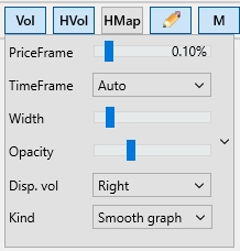
The HVol button enables the display of horizontal volumes (market profile). These are shown to the left of the chart as a histogram and help identify the boundaries of consolidation zones for the selected time interval, as well as the price levels where the highest trade volumes occurred. These peaks highlight key support and resistance levels where the price may approach, bounce off, or break through and continue moving.
-
PriceFrame – sets the price step. If set to 0%, the terminal calculates buy/sell volumes at each price level (e.g., 1000, 1001, 1002, etc.). If set to 1%, volumes are calculated within a 1% range from the current price (e.g., around 1000, volumes from 995 to 1005 will be shown)
-
TimeFrame – sets the time period for calculating horizontal volumes. Available intervals: Auto, 1 min, 5 mins, 15 mins, 30 mins, 1 hour, 2 hours, 6 hours, 12 hours, 24 hours, Max. For example, selecting Max will use the maximum period (up to 42 hours). When TimeFrame is up to 24 hours, volumes are calculated from trades; when above 24 hours — from candles. The Max setting is most commonly used — in this case, volumes are displayed with a gray outline, making it easy to spot the price level with the highest activity over the past 42 hours (the Max range may vary depending on the exchange). If you assume that the price will remain in a sideways movement (flat), the best entry points are usually closer to the lower boundary of the range, with an exit near the upper boundary. Additionally, you can highlight levels based on volume peaks, as these areas formed strong support or resistance, which are likely to remain significant as price continues to move — both for buyers and sellers
-
Width – sets the width of the volume histogram (as a percentage of the chart’s total width)
-
Opacity – adjusts the transparency of the volume histogram
-
Disp. vol – enables digital volume display on the cursor, either to the right or left of the histogram
-
Kind → Smooth Graph – sell volumes (red) are overlaid on buy volumes (green); the total length equals the greater of the two
-
Kind → Stacked Graph – sell volumes (red) are displayed to the left of buy volumes (green); the total length equals the sum of buy and sell volumes.